Posts Tagged design
The Evolution of Books : Edible and Smokable
Posted by sabathaly in Case Studies, Creative Work, Design, Innovation, Interactive, Thoughts, Trends on April 9, 2012
These books aren’t just regular books, they have literally transformed human’s everyday reading experience. An edible cook book and a smoke-able lyrics book? Yes, this is the era where you can pretty much consume EVERYthing.

Edible Cookbook That You Can Read, Cook And Serve . German design agency Korefe has created the first and only cookbook that you can read, cook and eat. This fun and innovative product has pages made from fresh pasta, which guide you through making a classic lasagne and prompt you to use the sheets as one of the ingredients.
Snoop Dogg’s Smokable Songbook is a promotional item for his Kingsize Slim Rolling Papers created by San Francisco agency Pereira & O’Dell. Each perforated page of the book is a rolling paper with the rappers song lyrics written on them in non-toxic ink. The songbook is made out of hemp and the spine can be used to strike a match.
Source : PSFK, vimeo
Ben & Jerry’s renames ice-cream in support of gay marriage
Posted by sabathaly in Case Studies, Consumer Insights, Creative Work, Design, Inspiring, Thoughts on March 14, 2012
One of today’s marketing strategy is to have deeper understanding on market’s socio-cultural traits and struggles. Ben & Jerry went as far as changing their product’s name in support of same sex marriage in the UK. Take a look at the article below :
Ben & Jerry’s, the Unilever ice-cream brand, is changing the name of its “Oh My! Apple Pie” ice-cream to “Apple-y Ever After”, in support of the UK’s proposal to legislate in favour of gay marriage.
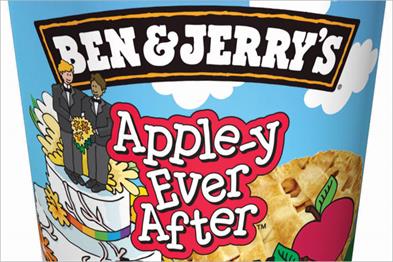
Ben & Jerry’s: rolls out Apple-y Ever After flavour. The ice-cream flavour’s packaging has also been redesigned and now features a male couple standing on top of a wedding cake.
The brand has partnered with Stonewall, the charity that campaigns and lobbies for the rights of gay, lesbian and bisexual people.
This week the UK Government is set to open its consultation on how to implement the legislation that will give equal marriage rights to gay people.
Ben & Jerry’s has also launched a Facebook app to encourage consumers to use the #applyeverafter hashtag on Twitter and send in their support for the legislation.
A dedicated part of Ben & Jerry’s UK site, http://www.benjerry.co.uk/our-values/appleyeverafter, displays information about why the brand has changed the name of its apple flavour, a link to the Facebook app and a drafted letter that consumers can use to send to their local MP.
Ben & Jerry’s said it has been an advocate for equal rights, regardless of sexual orientation, since the brand was created.
It ran similar activity in America to celebrate the introduction of gay marriage legislation in the brand’s home state of Vermont and renamed its “Chubby Hubby” ice-cream to “Hubby Hubby”.
Laura Doughty, deputy chief executive, Stonewall, said: “We’re truly moved by Ben and Jerry’s support for same-sex marriage in Britain. All people want is to call their long-term relationship by the same name as everyone else.
“Our strong advice to those who disapprove of same-sex marriage is just not to get married to some-one of the same sex”.
Source : http://www.brandrepublic.com/news/1121819/ben-jerrys-renames-ice-cream-support-gay-marriage/
Why Google has oodles of doodles
Posted by Grey Singapore in Design on September 5, 2011
From clever to cute, Google’s doodles are more than just a gimmick, they reflect the company’s ability to be both a global and local brand…

There used to be a time when trademark lawyers advised against tampering with a logo or adding superfluous elements to it. The concern was that these additions and modifications would, by changing the original design, create further unregistered and therefore unprotected devices and that the exclusive rights to the original trademark could be weakened, or even lost. Consistency was considered to be the safest way. A key objective of corporate design guidelines was to reinforce trademark protection by ensuring a standardised corporate logo and attendant visual identification system. Most large corporations still follow this principle.
Google, though, is different. It says that “having a little bit of fun with the logo is part of the brand” and the company wilfully and regularly violates its own trademark. Since 1998, Google has used over 1,000 variations of the corporate logo in the form of Google doodles, the remodelled and playful iterations of the wordmark that appear on the Google homepage to highlight various holidays and anniversaries of historic events. (If you want to see all the doodles from 1998 to the present, just search for ‘Google doodles’ or go straight to google.com/ logos.)
In March of this year, the US Patent and Trademark office granted Google a patent for its doodles but, surprisingly, that patent does not cover the individual doodle designs, instead, it relates to the invention of the idea and method of periodically changing the logo to entice people to the website. You might wonder how a company could be granted exclusive rights to the concept of frequently varying its logo, but that seems to be what has happened.
Flexible, or as it’s sometimes known, dynamic or fluid branding, is not a new concept [see a previous CR post here]. We can all think of logos that have variants for use in differing contexts. For example, Minale Tattersfield’s identity for Heal’s back in 1983, and more recently, the Wolff Olins scheme for Aol. In my own career I have created a number of such schemes, the earliest of which, for Priba Supermarkets in Belgium, dates from 1973. I can see that Google might want to prevent search engine competitors such as Bing and Yahoo! from doing similar things, but I remain puzzled as to how the company could have been granted exclusive rights to the notion of flexible branding that’s been used by many other organisations for so long. Attitudes to brand building and brand protection are always changing and if, today, Google’s lawyers are happy that the doodles do not threaten the protectability of the core Google brand, then I can see no reason why the doodles should not be deployed.
Like most people, I use Google as my main search engine and when a new doodle appears it usually raises a smile as I try to guess what it represents. Some are obvious while others need a bit more deciphering. I particularly enjoy the more abstract designs: the recent Alexander Calder mobile, the Les Paul guitar and the Braille dots, for example (all shown above). Some of the more entertaining doodles are interactive, whilst others use animation, sound, and occasionally, live streaming.
Google is, of course, both global and local and the doodles reflect this. Some appear worldwide while others mark local events and only appear in the relevant countries. Large corporations like Google strive to create a sense of community among users and customers and the doodles support this aim. The doodles have a keen following and, although most designs are intended to have a life span of only 24 hours or so, some have been brought back by public demand and have been allocated their own individual Google web pages so they can live on in perpetuity – the Les Paul and Pac-Man doodles are two that have been honoured with this treatment. There’s even a Doodle Store on the Google website where you can buy T-shirts, stickers and posters featuring various popular doodles.
Some doodles are developed through open competition and it’s possible for the public to submit ideas and designs for consideration. In this way we’re encouraged to share in the Google fraternity. When local events are ‘doodled’, the global corporation perhaps appears a little less monolithic and a bit more approachable.
As a designer, my main concern with the Google doodles is to do with the quality of the designs. Most of them are created by Chief Doodler Denis Hwang and his in-house team of designers. Some iterations are witty, intriguing, and well put together. Others, and particularly those that are developed through competitions, such as the Doodle 4 Google competition for schoolchildren, are, unsurprisingly, often visually crude, over cute, and amateurish. But the Google brand is probably big enough and strong enough to withstand these variations and a bit of corporate playfulness is to be welcomed.
That said, a global corporation, particularly one operating at the forefront of new information technology and openly committed to leading the way in its field, should demonstrate excellence in all that it does. Google says that its doodles are intended to “reflect Google’s personality and love for innovation” and when it describes its values, the company says it has a “minimalist ethic” and is on a quest to create products that are “simple” and “beautiful” as well as “innovative”. If those are core values, then it follows that all expressions of its identity, including the design of its doodles, should convey those values and be of the highest creative and artistic quality.
It’s been suggested that Google may have grown too big or become too corporate to accommodate quirky and entertaining doodles, but I don’t hold that view; the company describes its working atmosphere as “casual”, so the informal doodles do fit the relaxed culture.
I do, however, think that Google, in its quest for ‘beautiful’ solutions, is too good a business to embrace inferior doodles. I’m all for a bit of fun, but I think there is also room here for a bit more quality control.
John Lloyd is a founding partner of the design consultancy, Lloyd Northover, and now works as an independent consultant, artist and writer. johnlloyd.uk.com
Source: Creative Review
International Network

